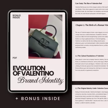
Valentino Brand Identity Evolution: Codes, Icons, Strategy
Evolution of Valentino Brand Identity: Luxury Codes, Visual Signatures, and Strategic Shifts
Valentino’s brand identity has been built through a tight set of recognizable codes—color, couture craftsmanship, romantic symbolism, and a consistent sense of Italian luxury—while still adapting to changing leadership, markets, and cultural tastes. The house’s visual language tends to feel polished and intentional, whether it’s expressed through a single saturated hue, a couture-level construction detail, or a campaign that leans into cinematic emotion. Tracking how these signals persist (and when they intentionally shift) reveals a practical blueprint for how luxury brands protect heritage while staying current. For more guidance, see Exploring the generative AI potential in the fashion design process.
Valentino’s core identity codes that stayed recognizable
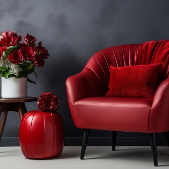
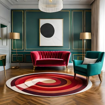
Signature color as an identity anchor
“Valentino Red” works like a shortcut to recognition: it reads as bold but refined, dramatic without looking loud. As a runway device, it can unify a collection, punctuate a finale, or instantly differentiate product drops—especially in accessories where a single colorway can become the story. For further reading, see [PDF] PROGRAM OF THE 77TH ANNUAL MEETING.
Couture credibility as brand proof
Even when customers are buying ready-to-wear or accessories, couture remains the credibility engine. Visible handwork, precise tailoring, elevated fabric choices, and atelier storytelling function as legitimacy cues—reminding the market that the brand’s price is justified by craft, not just branding.
Romantic glamour and Italian elegance
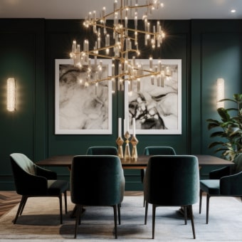
Across eras, Valentino’s personality often centers on romance: softness balanced with authority, elegance balanced with sensuality. The house’s “Italian” signal is less about clichés and more about proportion, polish, and a confident sense of occasion dressing.
House iconography that keeps continuity
Motifs such as “V” branding, refined typography, florals, and recognizable accessory details create consistency across changing collections. Iconography is especially powerful because it can live at multiple scales—from a subtle hardware element to a campaign-level visual motif—without requiring the entire product to be logo-forward.
Heritage vs. novelty (a controlled tension)
Luxury identity rarely survives through repetition alone. Valentino’s most durable strategy is keeping a few anchors stable (craft, romance, signature tones) while refreshing the “frame” around them—casting, styling, art direction, and the balance between quiet and overt branding.
| Identity asset | What it signals | Where it shows up |
|---|---|---|
| Valentino Red | Instant brand recall; bold confidence; couture heritage | Runway looks, campaign styling, accessory colorways |
| Couture craftsmanship cues | Authenticity and high value; artisan credibility | Garment construction, editorial features, brand storytelling |
| Refined logotype / typography | Luxury restraint; clarity and authority | Packaging, website headers, product labels |
| Icon accessories (e.g., studs and structured bags) | Commercial icons that scale brand recognition | Accessories lines, seasonal variations, influencer placements |
| Romantic visual tone | Emotional appeal; aspirational femininity/beauty | Campaign art direction, runway sets, photography |
A timeline of identity evolution: from couture house to global luxury brand
Early foundation: couture-first prestige
The brand’s earliest identity was built on high-formality refinement: impeccable silhouettes, celebrity visibility, and a consistent “special occasion” point of view. The house codes were relatively concentrated—making the look easy to recognize even when trends changed around it.
Expansion: translating couture into categories
As the business grew into ready-to-wear and accessories, the challenge became scale without dilution. Successful luxury expansion typically keeps couture as the halo while allowing accessories to carry repeatable signatures—details that are recognizable, manufacturable, and seasonally updateable.
Globalization and digital acceleration
As audiences moved across platforms, brand identity became a multi-channel system. Campaign pacing, social-first crops, and faster product cycles required clearer visual rules—what the brand looks like in a thumbnail, a storefront window, and a long-form video all at once.
Creative leadership changes
Modern luxury expectations
Visual identity system: logo, typography, color, and layout decisions
Logo usage: overt branding vs. quiet luxury
Typography and spacing
Color strategy beyond red
Photography, film, and tactile continuity
Brand architecture and product identity: couture, RTW, accessories, and licensing
Couture as the halo
Accessories as identity accelerators
Fragrance/beauty and collaborations
Retail experience as identity in 3D
Luxury strategy lessons drawn from Valentino’s identity shifts
Recommended resources and products (in stock)
For a structured, study-ready breakdown of Valentino’s codes and turning points, explore the Evolution of Valentino Brand Identity – Complete valentino brand identity evolution eBook Guide for Fashion Branding, Luxury Strategy & Visual Identity Study. To apply similar identity thinking to wardrobe-driven styling (bows, proportion, and feminine detailing), consider the Elegant Korean Style Bow Pockets Short Coat for Women. For values-led lifestyle storytelling that increasingly influences luxury messaging, the Eco-Friendly Laundry Day Checklist | Sustainable Living Guide | Digital Download Printable for Green Home & Zero Waste Lifestyle can complement sustainability-focused brand narratives.
Further reading (authoritative sources)
For primary brand positioning and current collections, visit the Valentino Official Website. For historical runway context and season-by-season references, browse Vogue Runway — Valentino. For broader luxury and fashion market context, see Business of Fashion — The State of Fashion.
FAQ
What makes Valentino’s brand identity instantly recognizable?
Signature color (especially Valentino Red), couture craftsmanship cues, and a consistent romantic-elegant mood create fast recognition. Refined typography and repeatable icon details keep that identity legible across categories and seasons.
How does a luxury brand evolve without losing its heritage?
It keeps a few core codes constant—such as craft standards, a defined emotional tone, and key visual signatures—while updating silhouettes, casting, campaign style, and channel strategy. This balance allows novelty to feel like evolution rather than a break from identity.
Is this eBook useful for building a fashion brand identity from scratch?
Yes—especially for students, founders, designers, and marketers who need a framework for identifying enduring codes, mapping turning points, and translating visuals into strategy. The method can be adapted to a new label by defining non-negotiables first, then building icons and storytelling around them.


Leave a comment