Decoding Hermès: Craft, Scarcity, and Brand Aura
Inside the Hermès Aura: What Builds the Brand Image and How to Study It
Hermès is often described as more than a luxury house—its reputation is built through restraint, craftsmanship, scarcity, and a carefully protected visual world. The result is an “aura”: a set of cues that makes the brand feel enduring, hard to imitate, and quietly authoritative. Understanding how that aura is constructed is useful for anyone studying luxury branding, visual identity systems, product design language, or retail experience design. For more guidance, see [PDF] HERMÈS and Craft Fetishism – Smithsonian Research Online.
Rather than treating the Hermès image as something mysterious, it can be analyzed as a repeatable structure: what you can see (design codes and touchpoints) and what you’re meant to feel (trust, status, exclusivity, permanence). When those two layers align across every channel, the brand world stays coherent—even when trends change. For further reading, see [PDF] Hermes Multi-sensory Brand Identity Design Study – Atlantis Press.
What the “Hermès Aura” Means in Practice
An aura is the combination of signals that creates perceived value beyond raw materials. With Hermès, those signals are consistent: heritage, workmanship, controlled visibility, and long-term continuity. The brand’s prestige is communicated through understatement—quiet design, minimal logos, and a refusal to chase novelty for its own sake.
That consistency is reinforced at every touchpoint: product design, packaging, store experience, editorial presence, and word-of-mouth. A practical way to study it is to separate what is seen (visual codes like color, proportion, typography, and materials) from what is felt (status, trust, discretion, and exclusivity). When the “seen” layer is stable over time, it strengthens the “felt” layer.
Heritage and Craft: The Foundation of Credibility
Hermès’ equestrian origins and artisanal roots operate as a narrative anchor. The story isn’t treated like decoration; it’s positioned as a reason for the brand’s standards to exist in the first place. Craft is framed as the product’s “why,” making time and skill central to desirability.
Another core element is consistency over trend-chasing. When a house builds a reputation for permanence, customers interpret it as a form of trust: designs won’t look dated overnight, and materials and construction are meant to last. Scarcity then reads less like a tactic and more like a byproduct of capacity, selectivity, and a slow, careful process—especially when the brand is disciplined about what it releases and how it presents it.
For background and corporate context, it helps to read the brand’s own materials and reference sources such as the Hermès official website, the company’s Investor Relations documents, and an independent overview like Encyclopaedia Britannica.
Visual Codes: Color, Materials, and Quiet Signatures
Hermès visual language is recognizable without relying on loud branding. Color is one of the most immediate cues, especially through packaging. Materials and finishes—leathers, silks, hardware choices, and balanced proportions—signal restraint. Typography and layout typically prioritize clarity and heritage over novelty, with generous spacing and calm compositions.
Importantly, signature motifs function as subtle identifiers. They are designed to be recognized by insiders, which deepens the “quiet status” effect: recognition becomes a form of cultural literacy, not an announcement.
Common Hermès Brand Cues and What They Communicate
| Brand cue | Where it shows up | Typical message conveyed | What to look for when analyzing |
|---|---|---|---|
| Orange packaging | Boxes, shopping bags, brand collateral | Instant recognition, heritage continuity | Consistency of tone, finish, and restraint in printing |
| Minimal logo presence | Products and visuals | Confidence, discretion, insider status | How branding stays secondary to form and material |
| Craft-forward storytelling | Product pages, press, store messaging | Legitimacy, patience, mastery | Language about artisanship vs. hype language |
| Timeless silhouettes | Bags, leather goods, apparel | Durability, permanence, investment mindset | Limited seasonal distortion; stable proportions |
| High-touch retail experience | Boutiques, packaging, service flow | Trust, ritual, exclusivity | Appointment dynamics, presentation, aftercare cues |
Scarcity, Access, and the Role of Social Proof
Retail, Packaging, and Service as Brand Theater
How to Analyze the Hermès Brand Image Step by Step
Digital Download Guide: What It Helps Clarify
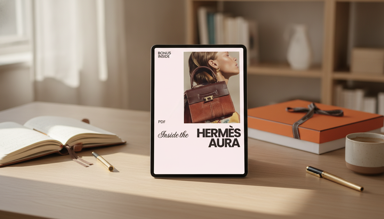
If a structured framework makes analysis easier to repeat, Inside the Hermès Aura: The Ultimate Guide to the Hermès Brand Image Explained (Digital Download) is designed to help organize what you notice into clear components. It focuses on separating visual cues from experiential cues, with prompts and checkpoints that keep the study consistent across different brand materials.
For adjacent inspiration in building a “quiet” wardrobe mood board, pieces with restrained details can support the same visual discipline—such as the Elegant Korean Style Bow Pockets Short Coat for Women. And because longevity is part of the luxury mindset, care rituals matter; the Eco-Friendly Laundry Day Checklist | Sustainable Living Guide | Digital Download Printable for Green Home & Zero Waste Lifestyle can help structure maintenance habits that keep garments and textiles looking their best.
FAQ
What makes Hermès different from other luxury brands?
Hermès stands out through craft and heritage as the core story, restrained branding that doesn’t rely on loud logos, and design codes that stay consistent over time. Scarcity is typically framed as a result of standards and production realities rather than constant trend cycles.
Is the Hermès aura mainly about scarcity?
Scarcity is only one layer. The aura depends on coherence across craftsmanship, calm visual codes, controlled presentation, and retail rituals that reinforce trust, discretion, and permanence.
What is included in the digital download?
It’s a structured guide for analyzing the Hermès brand image, organized into clear sections with prompts and checkpoints for evaluating visuals, messaging, and experiential cues. The goal is to make observations easy to capture, compare, and reuse as a repeatable study method.


Leave a comment